Task 1: About Me
Hi! My name is Raina Doshi. I am very excited to join the Masters in Analytics and Management programme and learn and grow with the incredibly diverse community at London Business School!
My Journey So Far
Born and brought up in Mumbai, India, I decided to step out and leave home for pursuing my Bachelors in Computer Science Engineering from Manipal Institute of Technology. Located in a small town in Southern India, Manipal is a student township where I had an enriching academic experience and created bonds for a lifetime. After my under-graduation, I worked as a Business Analyst at Dell Technologies. Being a part of Dell Global Analytics made me realize the power of data driven decision making and I decided to pursue the MAM programme at LBS to explore the vast field of analytics and unleash it’s true potential by integrating it with business.
The last one year with strict lockdowns in India and work from home, gave me some time to introspect and work on hobbies which I never felt I had the time for. I learnt how to ski, went cycling around Mumbai, documented memories by learning video editing and journaling.
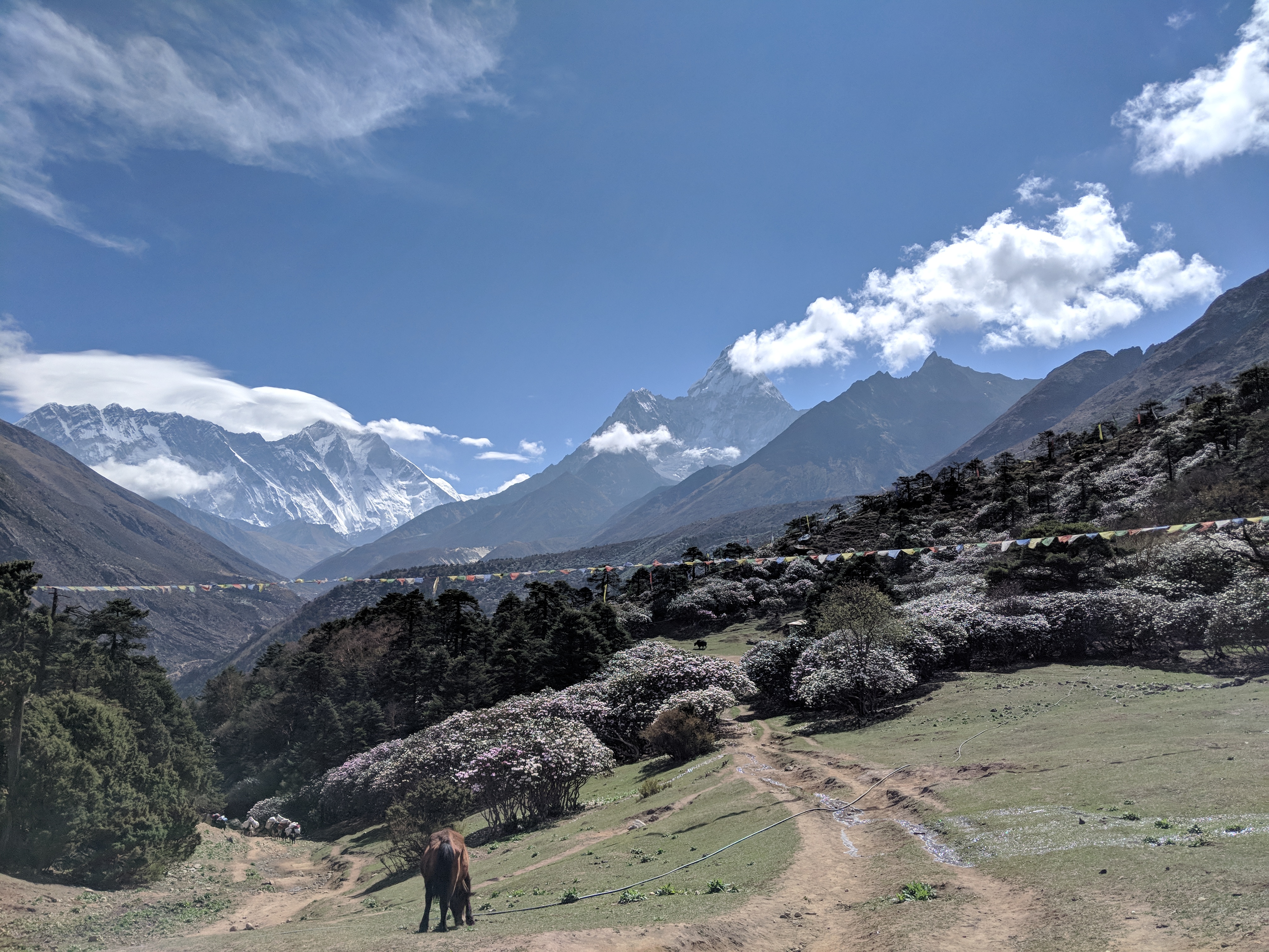
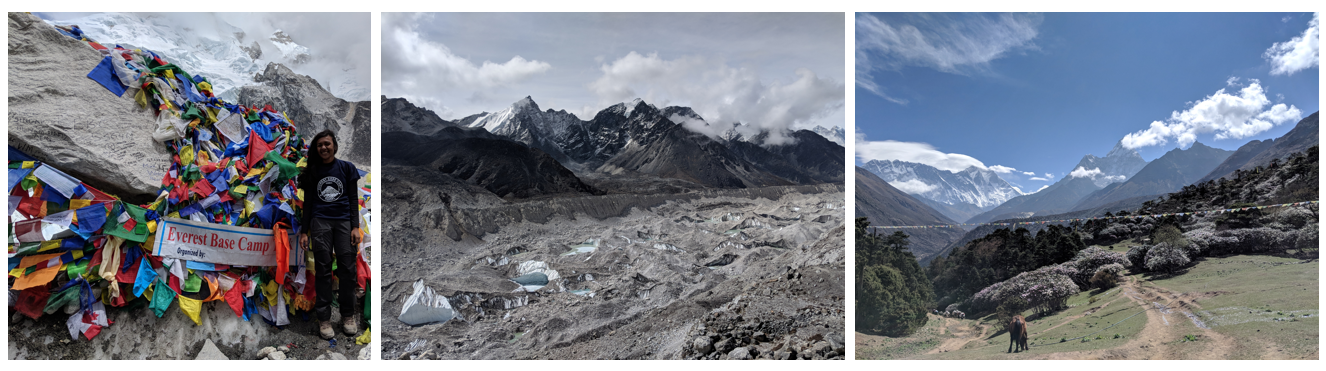
I am a passionate trekker and graphic designer (you can check out a few of my designs here),and I enjoy cycling and photography. After I went on my first trek, my love for mountains grew, and since then I have gone on several high-altitude snow treks including one to Everest Base Camp, in the rugged terrain of Nepal where we trekked up to 18000 feet. The mountains help me rejuvenate and find peace from the hectic city life.
Here are my favourite snaps from the trek:
The Path Ahead
I am excited to move to London, join the diverse community at LBS and grow holistically both personally and professionally. Post my Masters, I wish to join a global consulting firm and work in strategy and technology consulting.
There are two main reasons which drive me to become a strategy consultant.
I view it as a sector which offers continual learning- be it about the client company, the case at hand or the varied types of data you must investigate.
It is a challenging atmosphere which tests your potential daily. Partnering with clients and transforming their organizations in the ways that matter most to them, by providing creative and realistic solutions is thrilling.
Through the MAM programme and my time at LBS, I aim to augment my skill set, work and interact with people of different backgrounds, learn from skilled mentors and build life long relationships.
Apart from upskilling, I definitely want to explore England. I visited London back in 2008 and want to recreate those moments once again. Some activities definitely on my bucket list are-
Exploring Lake District and the beautiful country side of Scotland
Watching a Formula 1 Race at Silverstone
Seeing the beautiful fireworks over Tower Bridge at New Years’
Visiting the Harry Potter World in Leavesden
Open to trying new things, so feel free to recommend some things which I shouldn’t miss!
Task 2: gapminder country comparison
You have seen the gapminder dataset that has data on life expectancy, population, and GDP per capita for 142 countries from 1952 to 2007. To get a glimpse of the dataframe, namely to see the variable names, variable types, etc., we use the glimpse function. We also want to have a look at the first 20 rows of data.
glimpse(gapminder)## Rows: 1,704
## Columns: 6
## $ country <fct> "Afghanistan", "Afghanistan", "Afghanistan", "Afghanistan", ~
## $ continent <fct> Asia, Asia, Asia, Asia, Asia, Asia, Asia, Asia, Asia, Asia, ~
## $ year <int> 1952, 1957, 1962, 1967, 1972, 1977, 1982, 1987, 1992, 1997, ~
## $ lifeExp <dbl> 28.801, 30.332, 31.997, 34.020, 36.088, 38.438, 39.854, 40.8~
## $ pop <int> 8425333, 9240934, 10267083, 11537966, 13079460, 14880372, 12~
## $ gdpPercap <dbl> 779.4453, 820.8530, 853.1007, 836.1971, 739.9811, 786.1134, ~head(gapminder, 20) # look at the first 20 rows of the dataframe## # A tibble: 20 x 6
## country continent year lifeExp pop gdpPercap
## <fct> <fct> <int> <dbl> <int> <dbl>
## 1 Afghanistan Asia 1952 28.8 8425333 779.
## 2 Afghanistan Asia 1957 30.3 9240934 821.
## 3 Afghanistan Asia 1962 32.0 10267083 853.
## 4 Afghanistan Asia 1967 34.0 11537966 836.
## 5 Afghanistan Asia 1972 36.1 13079460 740.
## 6 Afghanistan Asia 1977 38.4 14880372 786.
## 7 Afghanistan Asia 1982 39.9 12881816 978.
## 8 Afghanistan Asia 1987 40.8 13867957 852.
## 9 Afghanistan Asia 1992 41.7 16317921 649.
## 10 Afghanistan Asia 1997 41.8 22227415 635.
## 11 Afghanistan Asia 2002 42.1 25268405 727.
## 12 Afghanistan Asia 2007 43.8 31889923 975.
## 13 Albania Europe 1952 55.2 1282697 1601.
## 14 Albania Europe 1957 59.3 1476505 1942.
## 15 Albania Europe 1962 64.8 1728137 2313.
## 16 Albania Europe 1967 66.2 1984060 2760.
## 17 Albania Europe 1972 67.7 2263554 3313.
## 18 Albania Europe 1977 68.9 2509048 3533.
## 19 Albania Europe 1982 70.4 2780097 3631.
## 20 Albania Europe 1987 72 3075321 3739.Your task is to produce two graphs of how life expectancy has changed over the years for the country and the continent you come from.
I have created the country_data and continent_data with the code below.
country_data <- gapminder %>%
            filter(country == "India") # just choosing Greece, as this is where I come from

continent_data <- gapminder %>%
            filter(continent == "Asia")
First, create a plot of life expectancy over time for the single country you chose. Map year on the x-axis, and lifeExp on the y-axis. You should also use geom_point() to see the actual data points and geom_smooth(se = FALSE) to plot the underlying trendlines. You need to remove the comments # from the lines below for your code to run.
plot1 <- ggplot(data = country_data, mapping = aes(x = year, y = lifeExp))+
geom_point() +  geom_smooth(se = FALSE)+   NULL

plot1
## `geom_smooth()` using method = 'loess' and formula 'y ~ x'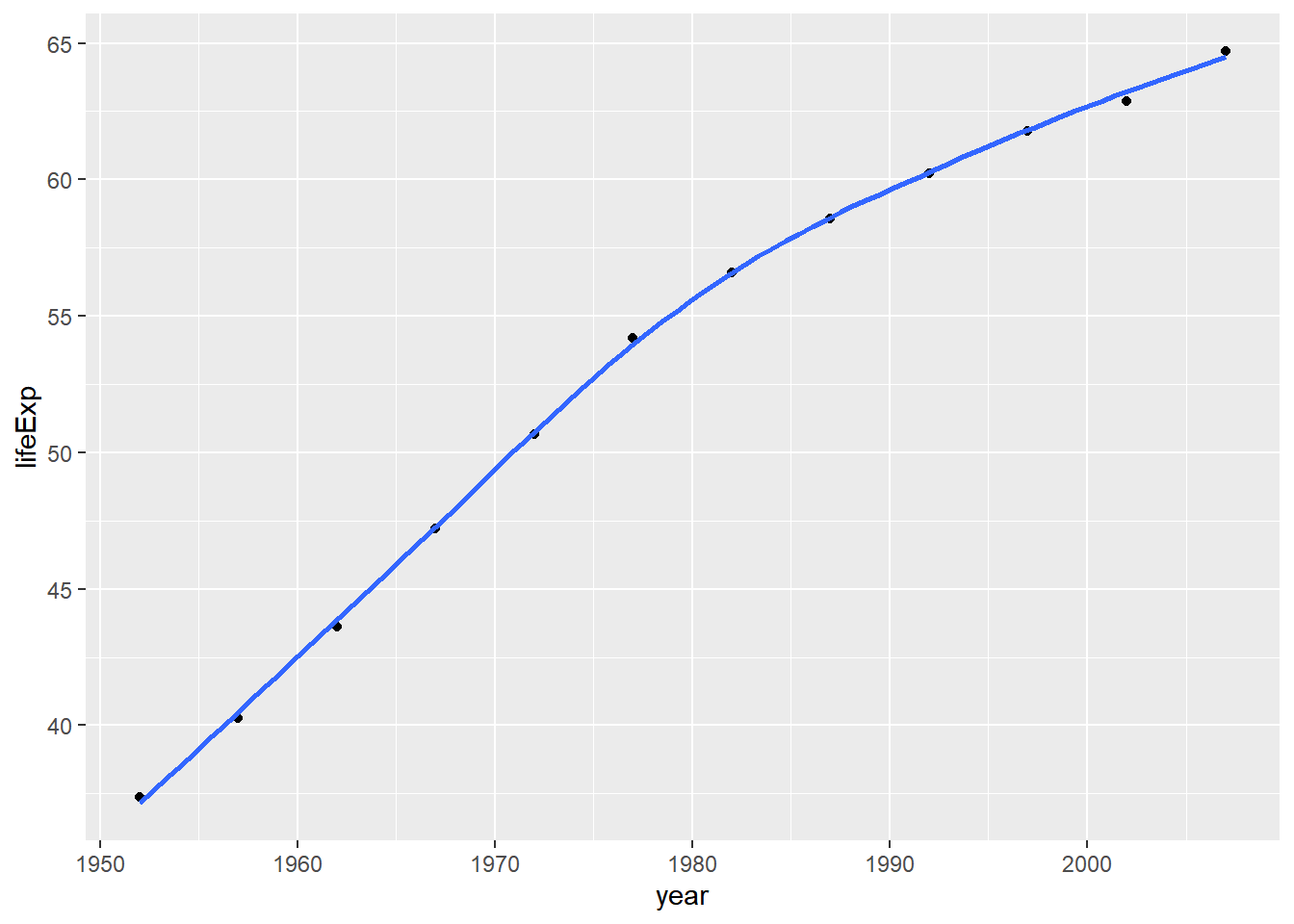
Next we need to add a title. Create a new plot, or extend plot1, using the labs() function to add an informative title to the plot.
plot1<- plot1 + labs(title = "Country Life Expectancy", x = "Years",y = "Expectancy") +   NULL


plot1
## `geom_smooth()` using method = 'loess' and formula 'y ~ x'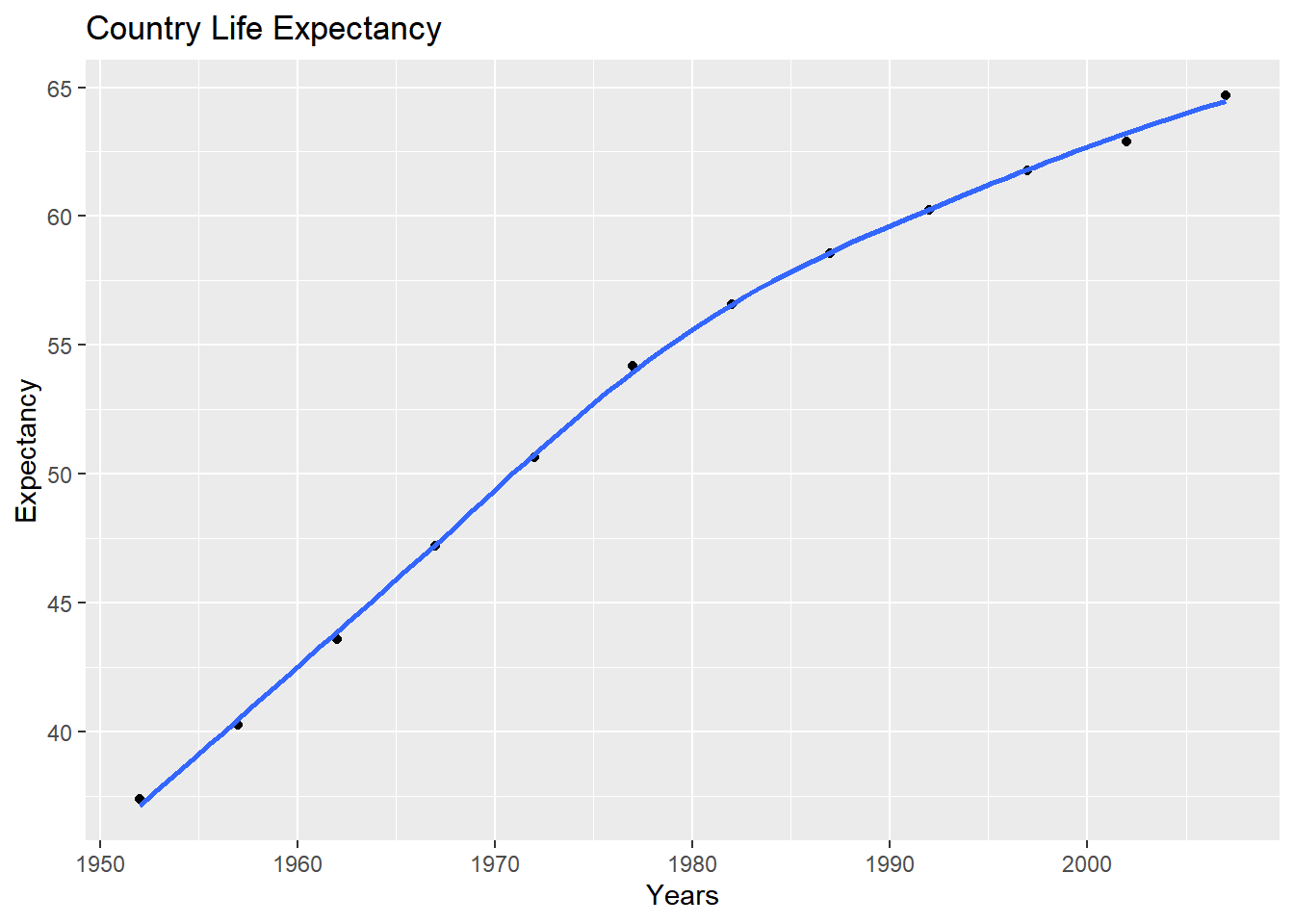
Secondly, produce a plot for all countries in the continent you come from. (Hint: map the country variable to the colour aesthetic. You also want to map country to the group aesthetic, so all points for each country are grouped together).
ggplot(data = continent_data, mapping = aes(x = year , y = lifeExp  , colour = country, group = country))+
  geom_point() +
  geom_smooth(se = FALSE) +
  NULL
## `geom_smooth()` using method = 'loess' and formula 'y ~ x'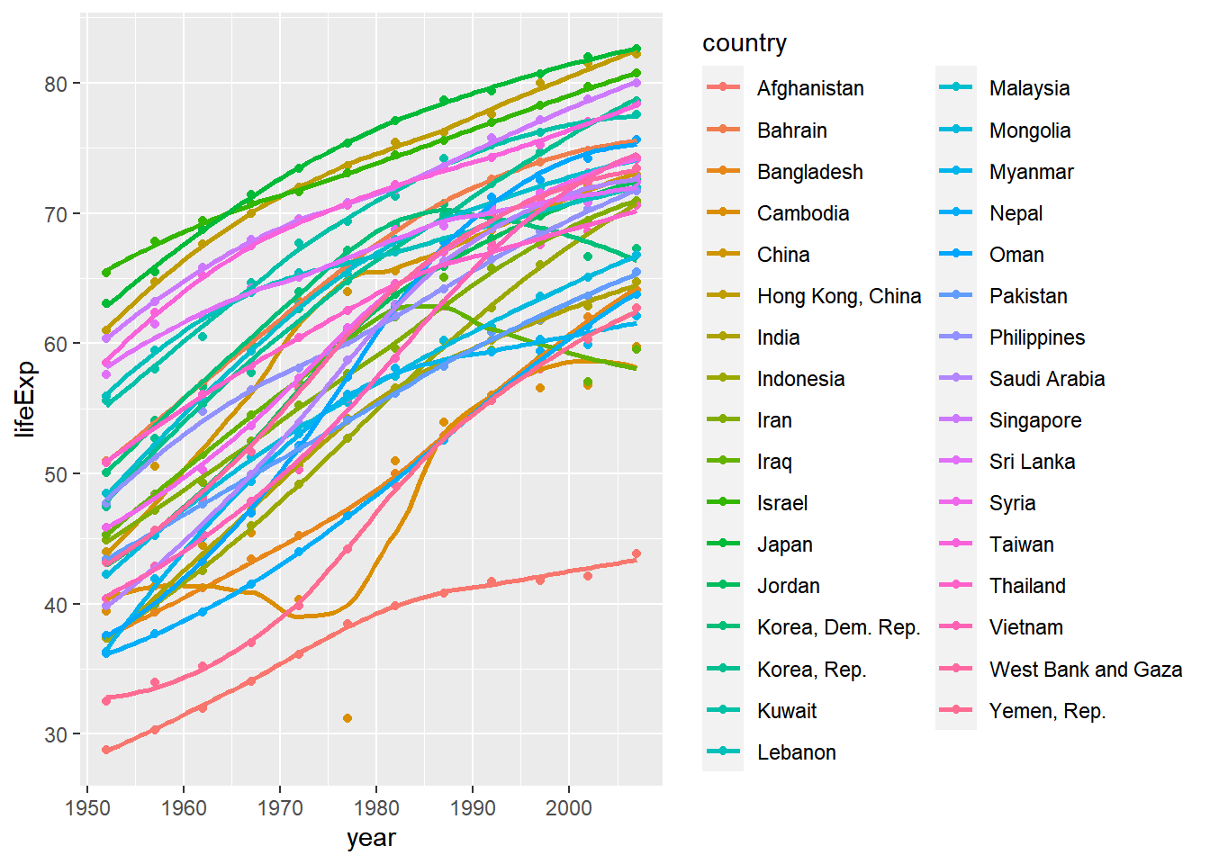
Finally, using the original gapminder data, produce a life expectancy over time graph, grouped (or faceted) by continent. We will remove all legends, adding the theme(legend.position="none") in the end of our ggplot.
ggplot(data = gapminder , mapping = aes(x = year , y = lifeExp , colour= continent))+
  geom_point() +
  geom_smooth(se = FALSE) +
  facet_wrap(~continent) +
  theme(legend.position="none") + #remove all legends
  NULL
## `geom_smooth()` using method = 'loess' and formula 'y ~ x'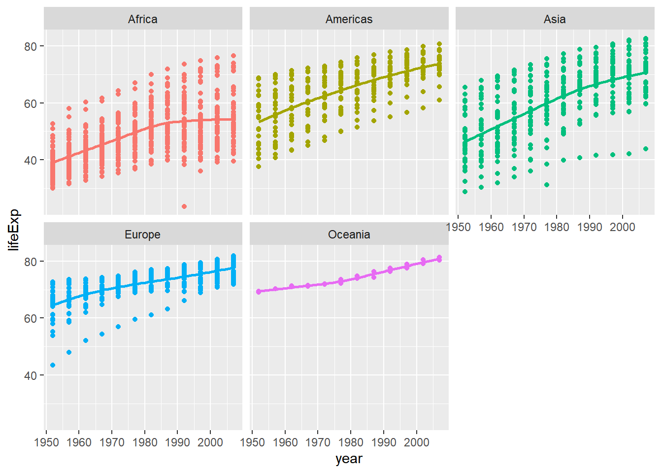
Type your answer after this blockquote.
Analysis-
As shown in the graph, the life expectancy all over the world and specifically in India has increased during the time period between 1952 - 2007.
This positive change could be attributed to improved healthcare, changes in socio-economic lifestyle, increased awareness about hygiene and decline in the spread of communicable diseases.
The next graph indicates the life expectancy in the 48 Asian countries. The graph shows that the trends in life expectancy in most of the countries is upward sloping. The life expectancy for Japan is almost 85 (2007) while Afghanistan has a life expectancy as low as 45 (2007).
Japan’s exceptional longevity can be mainly because of the good diet, regular exercise and healthy attitude to life, community and family - which is the general culture in Japan. With less than 15% of deliveries are attended by trained health workers, mostly traditional birth attendants, Afghanistan has the second highest maternal mortality rate in the world. Lack of basic health care and malnutrition contribute to the high death rates and low life expectancy as seen from the graph.
One of the outliers in the plot seems to be Cambodia that has a low life expectancy in 1977. The reason for this could be the Cambodian genocide, that resulted in the deaths of 1.5 to 2 million people from 1975 to 1979, nearly a quarter of Cambodia’s 1975 population.
The graph showing the life expectancy across continents has an upward sloping trend for all. This can be attributed to better health care and immunization, socio-economic changes and improved education and awareness among the people.
The main differences between the plots of the continents based on life expectancy is-
- Slopes of the lines in the continents - The difference in steepness attributes to the nature of the country i.e developing vs developed country. The faster pace of development in Americas while the slower growth in Asia and Europe.
- Outliers - Outliers have affected the shape of the trend line for the continent they are a part of.
- Number of data points - The high number of points in Asia and Americas are due to the higher population in these continents as compared to Oceania and Europe.